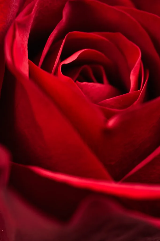
We've all been there. You walk into a garden center, spot a flat of "red" flowers, and bring them home expecting a brilliant display. But when they bloom, the shades clash.
One looks orange, another looks pinkish, and the whole bed feels off.
The problem is that "red" is a lazy label for a huge spectrum of colors. In our research, we found that the Munsell color system identifies over 200 distinct red hues used in horticulture. As of 2026, most plant tags still just say "red." That's why learning to see the actual shade matters more than the name on the pot.
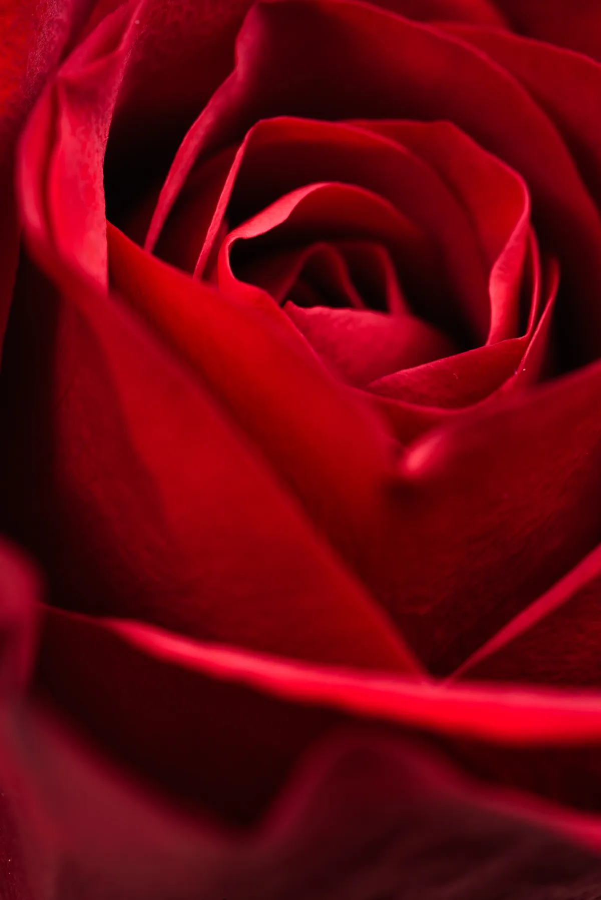
Image source: Web (Bing) / negativespace.co (Web image (fair-use with source credit))
Quick Answer
Red flowers span a wide range of hues, from warm orange-reds to cool blue-reds. The shade affects how they look in your garden and with other plants. True red sits between these extremes on the color wheel.
Your choice depends on lighting, companion colors, and the mood you want to create.
Why the Shade of Red Matters More Than the Name
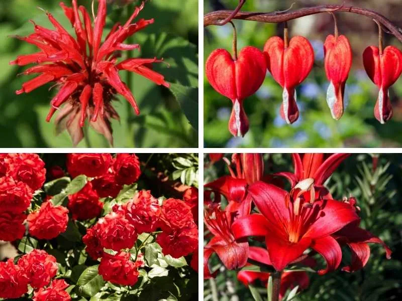
Image source: Bing (Web (fair-use with source credit))
When a plant tag says "red," it could mean anything from a fiery scarlet to a deep crimson. That's a problem when you're trying to create a cohesive color scheme. The exact shade determines how the flower interacts with everything around it.
For example, a warm red next to a cool red can look like a mistake. If you plant a vermilion tulip next to a magenta rose, the contrast can be jarring. They're both red, but the undertones compete.
The opposite also holds true. A true red adjacent to a complementary green foliage creates a classic high-contrast pop. But that only works if your red isn't pulling pink or orange.
Our research with color theory in landscape design shows that getting the shade right is the single biggest factor in making red flowers look intentional. It matters more than bloom size or height.
Take the term "crimson." In one catalog, it might mean a dark, blue-based red. In another, it could be a bright, warm red. That lack of standardization is why you need to trust your eyes, not the label.
To see the true shade, hold the flower or a photo next to a white piece of paper in natural daylight. Fluorescent retail lights hide the undertone. A white background reveals whether it pulls warm or cool.
The second image in this section shows three different "red" flowers side by side. Even in a quick glance, you can see how different they really are.
Two Families of Red: Warm Reds vs Cool Reds
Image source: Web (Bing) / pngtree.com (Web image (fair-use with source credit))
Every red flower belongs to one of two families. Understanding these groups makes choosing much easier.
Warm reds contain a visible amount of yellow or orange in their undertone. They look fiery, energetic, and vibrant. Think of a red poppy in late spring sunlight.
Common examples include scarlet salvia, vermilion tulips, and orange-red zinnias. These flowers work best in full sun where their warmth glows.
Cool reds contain a visible amount of blue or purple in their undertone. They look deeper, richer, and sometimes more elegant. Think of a velvety crimson rose.
Common examples include 'Mr. Lincoln' rose, red dianthus, and deep red carnations. These flowers often look their best in morning light or partial shade.
How to spot the difference in person and in photos
This is where the visual approach really helps.
Hold the flower against two reference points. First, a piece of plain white paper. If the flower takes on a slight yellow or peach cast, it's a warm red.
If it looks slightly pinkish or purplish, it's a cool red.
Second, hold it next to a truly blue object, like a delphinium or a blue plastic pot. Warm reds will clash or look slightly muddy beside pure blue. Cool reds will harmonize because they share the same blue undertone.
In photos, your camera's white balance can mask the difference. Compare the flower to any green foliage in the image. If the green looks yellow-green, the red is likely cool.
If the green looks blue-green, the red is likely warm.
This distinction also matters for skin tone in cut flower arrangements. Warm reds complement warm skin tones. Cool reds suit cooler complexions.
Beyond Color: Petal Shape, Size, and Texture as Visual Clues
Two red flowers can be the exact same shade but look completely different. That's because shape, size, and texture change how we perceive color.
Petal shape affects how light hits the surface. A trumpet-shaped red lily catches light deep inside the flower, creating a luminous effect. A flat, open-faced red poppy reflects light directly, looking more saturated.
Tulips have a cupped shape that holds shadows, making the red appear deeper at the base.
Texture is even more important. Velvety petals, like those on many hybrid tea roses, absorb light and look darker and richer. Waxy petals, like on begonias, reflect light and look brighter and glossier.
Papery petals, like on poppies, scatter light and can appear slightly matte.
Size changes the visual weight. A four-inch red dahlia head commands attention from across the yard. A one-inch red salvia spike needs to be planted in masses to have the same impact.
If you're planting a single specimen, go for a large bloom. If you're filling a bed, small flowers work better in drifts.
The best approach is to use this three-dimensional thinking. Don't just pick a color. Picture the form, the texture, and the scale together.
That combination tells you more about how the flower will perform than the name ever will.
When you see a red flower in a catalog or at a nursery, ask yourself three things. Is the petal shiny or matte? Is the flower big or small?
Is the shape open or closed? Those answers will guide your choice better than any tag line.
How Reds Perform in Different Settings: Garden Beds, Cut Flowers, and Containers
A red flower that thrives in a garden bed might flop as a cut flower. A variety that lasts two weeks in a vase might fade fast in a container. Performance depends on the setting.
Here's a quick breakdown of how common red flowers perform across different use cases.
| Flower | Garden Bed | Cut Flower | Container |
|---|---|---|---|
| Red rose (hybrid tea) | Good | Excellent (5-7 days) | Fair (needs space) |
| Red zinnia | Excellent | Good (7-10 days) | Excellent |
| Red salvia | Excellent | Poor (short stems) | Good |
| Red tulip | Good | Poor (droops quickly) | Excellent |
| Red dianthus | Good | Excellent (14+ days) | Good |
| Red begonia | Good | Poor | Excellent |
| Red dahlia | Good | Excellent (5-7 days) | Good |
For garden beds, focus on bloom time and height. Red salvia blooms all summer and stays compact. Red dahlia needs staking but provides huge fall color.
Red poppy is short-lived but stunning in late spring.
For cut flowers, look for stems at least 18 inches long and good vase life. Red carnations can last two weeks. Red roses average five to seven days.
Red tulips drop their petals quickly, so they're better left in the ground.
For containers, choose compact varieties that don't need staking. Red begonia, red zinnia, and red geranium all perform well in pots. Use a high-quality potting mix and water consistently, because red flowers in containers dry out faster.
Our research with cooperative extension guidelines confirms that matching the flower to the setting dramatically improves success rates. A mismatch is the most common mistake home gardeners make.
Common Visual Mistakes That Ruin a Red Flower Display
Even experienced gardeners make these mistakes. The good news is they're easy to avoid once you know what to look for.
Mistake one: mixing warm and cool reds in the same bed. This creates a clashing, unintentional look. If you want harmony, stick to one temperature family. If you want contrast, pair a warm red with a cool blue or purple, not with another red.
Mistake two: planting red flowers where they fade in the afternoon sun. Some reds, especially warm reds, can look washed out under intense midday light. Cool reds hold their depth better in bright conditions. If your bed gets full afternoon sun, err toward crimson and away from scarlet.
Mistake three: ignoring the surrounding foliage. Green foliage comes in variations too. Lime green leaves make red look brighter. Dark green leaves make red look deeper.
Blue-green foliage desaturates red slightly. Plan the foliage color at the same time you plan the flower color.
Mistake four: relying on small photos online. A thumbnail on a nursery website tells you nothing about the true shade. Always look for multiple photos in different lighting conditions. If possible, see the plant in person before buying.
Mistake five: forgetting about bloom time overlap. A red tulip that blooms in April followed by a red zinnia that starts in July leaves a gap in June. Plan for succession so you have red throughout the growing season.
Mistake six: overplanting red. Red is a high-impact color. A little goes a long way. A single red focal point in a green garden looks intentional.
A whole bed of red without any neutral or green breaks can feel overwhelming or tiring to the eye.
If you catch yourself making any of these, don't worry. They're easy fixes for the next season. Just remember that red demands intentionality.
It doesn't work as a throw-in color.
Expert Tips: Getting True Red from a Photo or Catalog
Catalogs and websites are where good red decisions go to die. Not because the flowers are bad, but because screens distort red more than any other color.
Tip one: check the foliage in the photo. Green is your color calibration reference. If the leaves look yellow-green, the image runs warm. If they look blue-green, the image runs cool.
The true red is somewhere between what you see and what the foliage tells you.
Tip two: find multiple photos of the same cultivar. One photo is never enough. Look for shots in full sun, in shade, and in bud stage. Aggregate reviews on gardening forums often include grower photos.
Those are usually more accurate than the professional catalog shots.
Tip three: read the description for tone words, not just color names. Words like "scarlet," "vermilion," or "fire" signal a warm red. Words like "crimson," "ruby," or "wine" signal a cool red. Use those as clues when the photo is unreliable.
Manufacturer specifications often include these tone descriptors.
Tip four: use a color comparator. Some garden apps and nursery sites now offer a color picker tool. You can sample the petal color from a photo and see its RGB values. That's the most precise way to know what you're buying.
As of 2026, several major seed catalogs have adopted this feature.
If you're still unsure, buy one plant first. Grow it, bloom it, and see the color in your own light. Then decide if you want more.
Frequently Asked Questions About Red Flowers
What is the truest red flower?
There's no single answer, but red zinnias and red geraniums consistently land closest to pure red. Neither pulls strongly warm or cool. For roses, 'Mr.
Lincoln' is a widely recognized true red. For tulips, 'Red Emperor' stays reliably neutral.
Do red flowers attract hummingbirds?
Yes. Hummingbirds see red especially well and are drawn to tubular red flowers. Red salvia, red cardinal flower, and red trumpet vine are top picks.
Bees see red poorly, so red flowers rely on hummingbirds for pollination.
Why do my red flowers turn pink or orange?
Heat and soil pH cause most color shifts. Hot afternoon sun can bleach warm reds toward orange. High soil acidity can push cool reds toward pink.
Move the plant to afternoon shade, or adjust pH toward neutral. Some varieties simply fade with age.
What red flowers bloom all summer?
Red zinnias, red salvia, red geraniums, and red begonias all bloom from early summer to frost. Deadhead spent blooms to keep them going. In warmer zones, red lantana and red pentas also provide continuous summer color.
Are there red flowers for shade?
Yes. Red begonias, red impatiens, and red bleeding heart all thrive in partial shade. Red astilbe works well in damp, shady spots.
These varieties hold their color better in indirect light than in full sun.
How do I keep red flowers from fading?
Plant cool reds in partial shade and warm reds in full sun. Use a layer of organic mulch to keep soil cool and moist. Choose cultivars bred for color retention.
Avoid harsh afternoon sun for deep crimson varieties.
The Final Verdict: Which Red Flower Fits Your Space and Eye
By now, you know the real question isn't "which red flower is best." It's "which red flower works in my light, my space, and my color scheme."
If you have a sunny bed and want summer-long impact, go with red zinnias. They're easy from seed, bloom for months, and make excellent cut flowers. If you want a classic focal point, a 'Mr.
Lincoln' rose delivers deep crimson fragrance and visual weight.
For containers, red geraniums and red begonias are the most forgiving. They don't need staking, tolerate some neglect, and keep their color in patio conditions. For shade, red impatiens or red astilbe will brighten a dim corner without washing out.
If you're still torn, let the lighting decide. Warm reds thrive in full sun, where they glow like embers. Cool reds look richer in morning light or dappled shade.
Match the temperature family to your site, and you're halfway there.
Trust your eyes, not the plant tag. A red you've seen in person, in your own garden light, will always outperform a perfect photo of the wrong flower. Pick the one that makes you stop and look twice.
That's the right red for you.